Bi-Weekly Update – 8/4/2019 Aug 4 - Sev
Literally nobody:
This update:
Another 2 weeks another update, but this one is starting on a bit of a somber note. It saddens me to say that our beloved Community Manager/Game Director/FOTUS Enthusiast, Tosh, is no longer a part of the i01 team. He has gone on to pursue bigger and dare I say maybe even better things. Although it's hard to see him go, we of course wish the best for him and hope what the future has in store is both great and fulfilling. So make sure if you see him around to give him a big old thanks for all he's done. However, even though he's gone, the game must go on and so does this update. So let's turn that frown upside-down and get into what the i01 team has been cooking up this week.
Here's a hint, it's art. A lot of art.
PAX West 2019
If you haven’t heard, which you should’ve because it happens every year, PAX West is coming up really soon. A large group of us from the i01 team will be attending from August 27th until September 3rd, and we’re planning to do all sorts of cool hangouts for the community. We also have something else really special planned, that I can’t fully talk about yet, but keep your eyes peeled for that as well. So if you guys see us around make sure to drop in and say hello there, we love seeing new and old faces!
The (Concept) Art of War
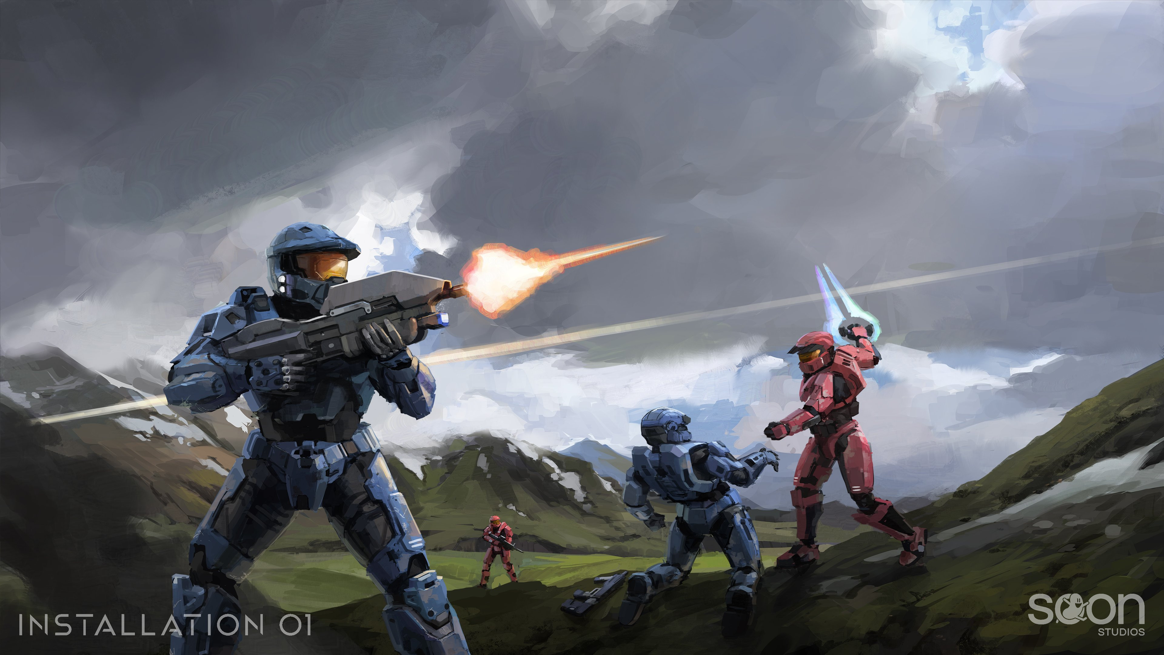
This is one of the pieces of artwork that you will likely see be featured on the i01 menu screen, created by Aviixe. Originally for this section I had only the finished piece of art to work with. However, I realized that there must be a lot more thought and decision making that goes into it that isn’t shown. You don’t just end up with a finished piece looking as beautiful as this without going through some sort of process with its own set of difficulties. So, I sat down with the Google doc Aviixe sent to me about the process to give us a little bit of insight about what goes into making a piece like this...
Aviixe: "Hey, Aviixe here to talk a bit about the experience of working on this artwork for the custom lobby menu.
Like the other two menu illustrations I did before, that were shown in previous weekly updates, this piece was pretty different than what I normally do on i01. Concept art doesn’t necessarily have to look that pretty all the time, it just needs to convey an idea or design well, but as this piece was purely an illustration that would be shown in one of the menus, it had to look great.
Before I did the final version of this piece, there was actually a previous version I spent a good while on. I did this sketch that I and the team were generally pretty satisfied with, but it had some major problems I didn’t notice."
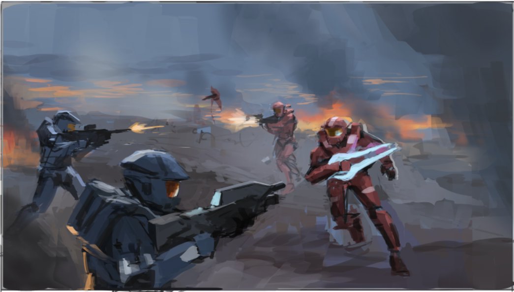
Aviixe: "As you can see, the “final” version is quite a bit different than the thumbnail, which was just me trying to render and detail my way out of the artwork’s actual problems. By the end, I realized the values were pretty shoddy and muddy and the four spartans were all pretty similarly sized and posed and placed in a way that was too repetitive. I was also too indecisive about what I wanted the background to be. I tried to correct it all, but really, a bland composition from the very beginning made it almost impossible to turn this piece around.
This piece definitely isn’t the worst thing I’ve ever made, but I don’t want to call an artwork complete if I’m not happy with it at all. Ultimately, I decided the piece was no longer worth saving, and wanted to start again completely, even though Greg Wasdyke the art boss man told me not to."
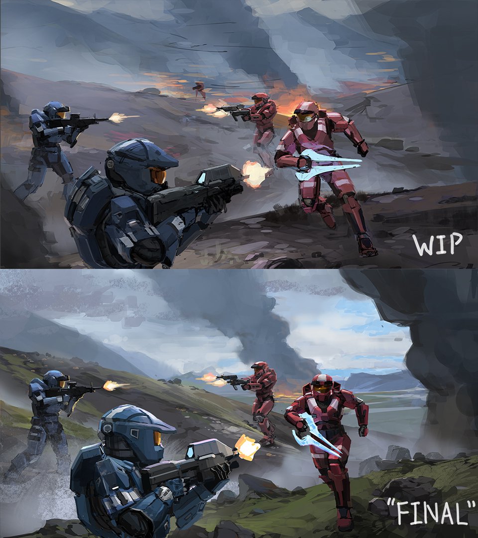
Aviixe: "To start off, I did a few loose greyscale thumbnails. I think the main reason the last piece had so many issues is because I didn’t take the time to get the initial thumbnail or sketch, that the final piece would be based on, to look solid, even if not perfect."
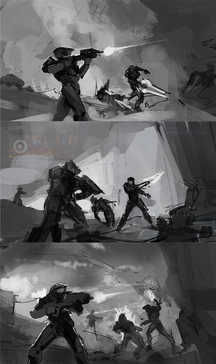
Aviixe: "The values of this piece are much more readable and structured, with areas of highest contrast placed around the focal points. The previous painting had values all over the place, with large ranges of lights and darks appearing in too many parts of the painting, which made it really hard to make big and effective changes to the composition if needed. The spartans also vary more in size and poses. The blue spartan shooting the assault rifle to something off camera and the bullet trace both indicate action outside of the frame, making the painting feel larger in a way."
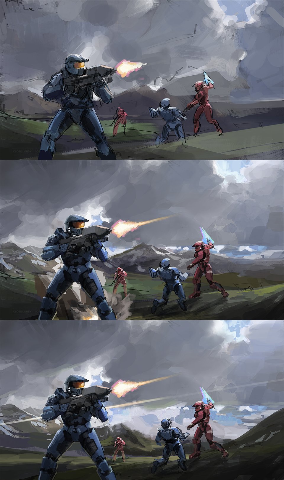
Aviixe: "That’s it! Hopefully there’s some takeaways in here you find useful. Just remember that no matter how well you may be able to detail/render a painting, it can’t fix a fundamentally flawed composition. Do those thumbnails!"
Well there you have it! I hope this gave some of you budding artists out there that inspiration you were looking for. Now that you guys also had a little sneak peek into the actual process, maybe you can find a greater appreciation for it. Pieces like these require quite a bit of time and dedication, they don’t just grow on trees unfortunately.
Community Spotlight
It's been a little while since we've had a Community Spotlight. So I took it upon myself to go through a bunch of the art from our discord and show off a few that caught my attention. There's a lot more that I couldn't fit in here, so make sure to check out the #art channel for yourself. Don't be afraid to share your own art and have a chance for it to be in the next community spotlight as well!
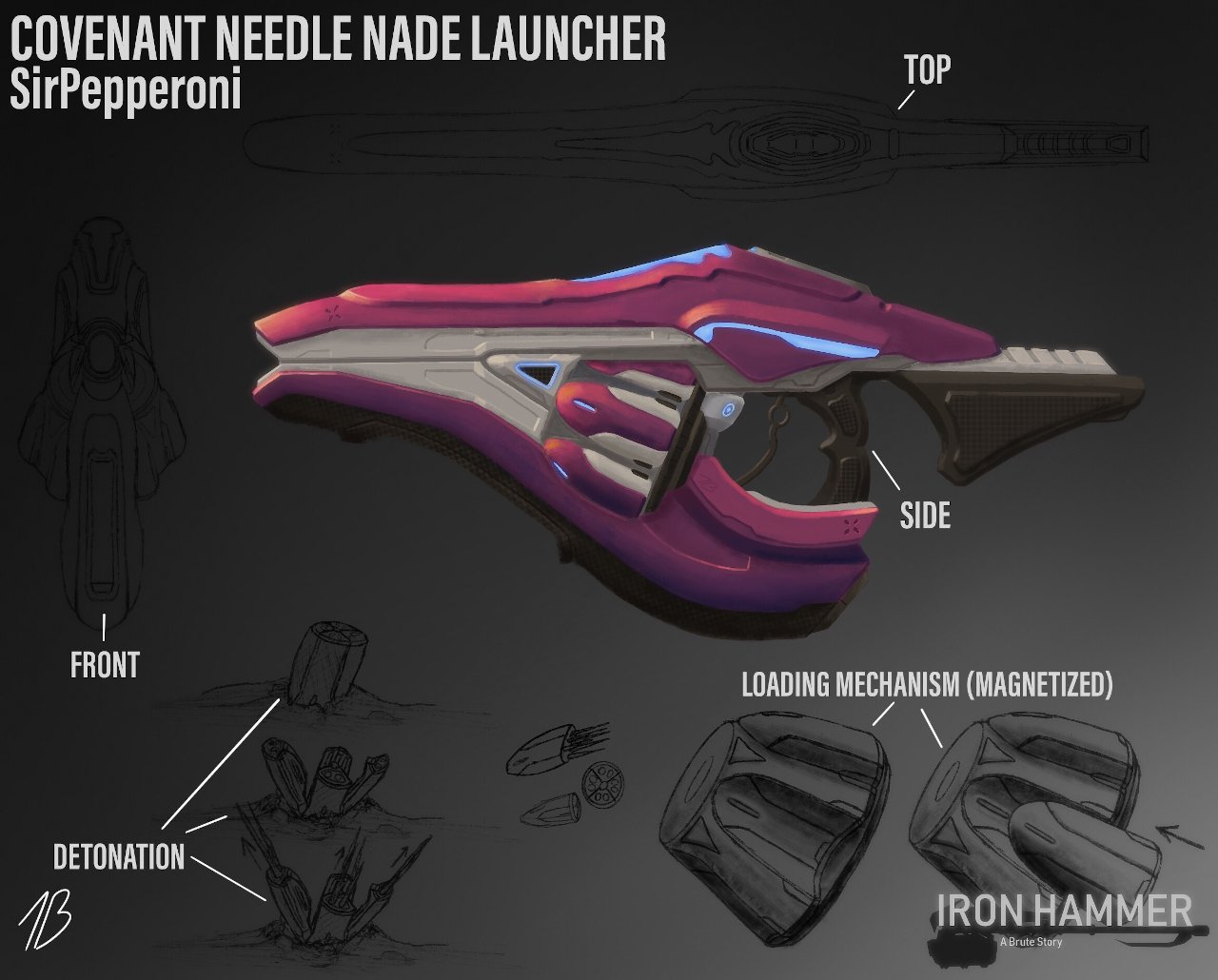
Art by SirPepperoni#5966
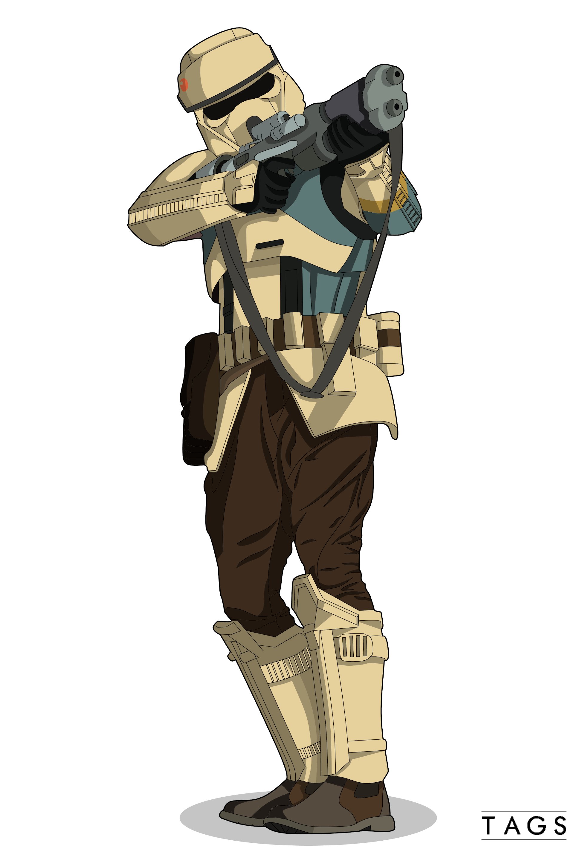
Art by Tags#3389
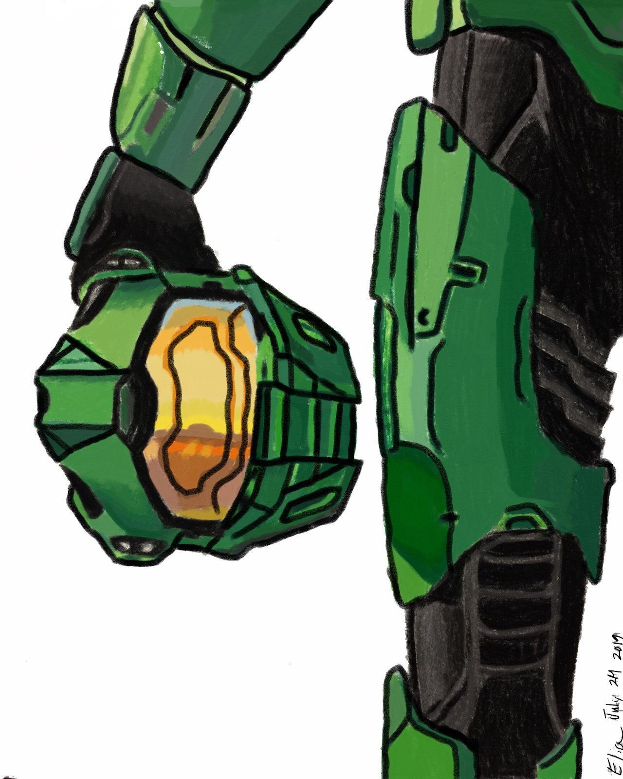
Art by spartan-0398#2236
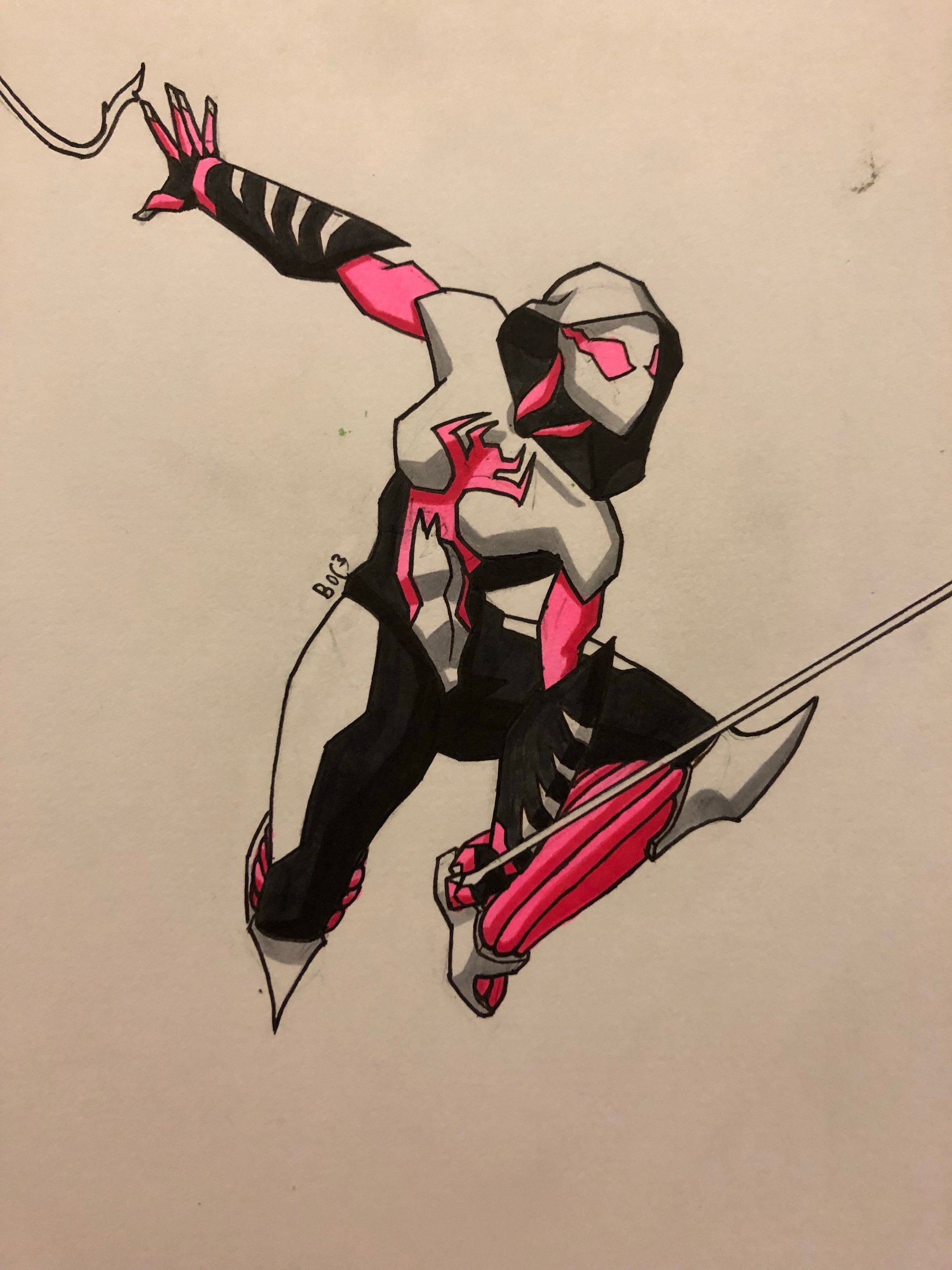
Art by Box04Chicken#2342
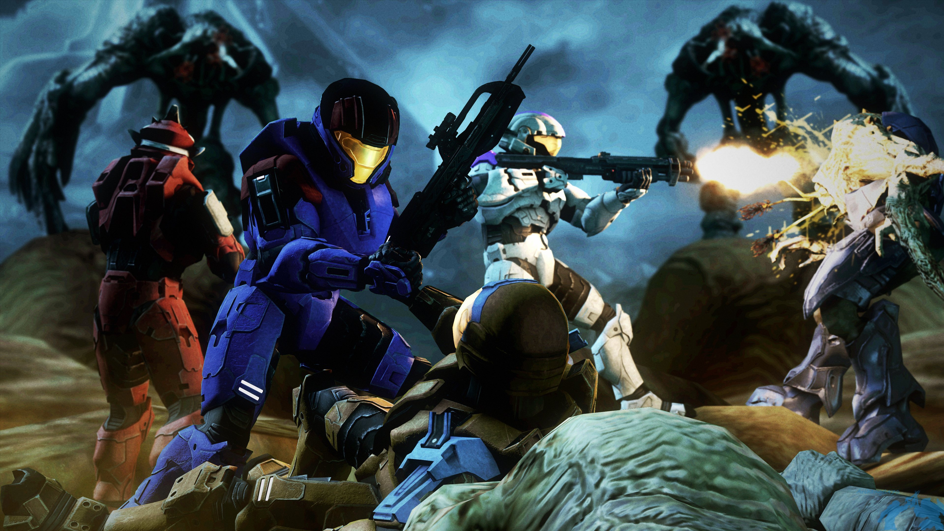
Art by Archangel470#3650
Quality Assurance
Here at the non-existent i01 studio we hold ourselves to the utmost standard of quality. But, you can't spell quality without "u". That's right, we need you. The i01 team is always looking for new talent, and I'm sure you're no exception (unless you don't have any of the required skills). So whip out those old game development skills you have locked away and just click that nice looking gradient button down there.
You know you want to.
Blame Bean
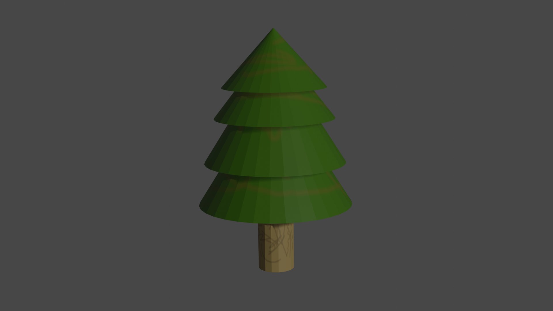
Our lovely Aussie programmer Dave made this tree. It's meant to symbolize the growth of i01, because similarly to a tree, the project has grown into something huge and beautiful. The many branches articulating the complex components of the project, working together to hold up the intricate imagery of the leaves. All the branches stemming from the main center, the core, the sturdy trunk that holds it all together, the development team united as one holding this masterpiece up. The roots symbolizing you guys, our community, providing us with the nutrients we need to survive.
I'm kidding, it's just a poorly made tree. He is a programmer after all. This is what we have to do when times get rough and we don't have enough artists. Maybe if all of you 3d artists applied to join the team, this wouldn't happen.
Well, here we are at the end again. In these updates we always try to showcase what we have available, while trying to balance that with what we can show. Those of you who see all these things we like to show off in these updates, and think "Wow, they should just release the game it looks good enough." This clip is for you…
Bam, get rekt.
Sev
Reddit Comments
View all comments