Bi-Weekly Update – 4/19/2020 Apr 19 - Sev
You know the old saying, "in for a penny in for a pound." Well I'm in here for two pounds, and not just because of how much I've been eating during quarantine, but rather I'm dedicated to this schedule now and I'm not going to let it slip.
This week's update brings us a look into the world that is Installation 01, and the different styles that we've formulated ourselves. Of course taking the word "ourselves" with a grain of salt considering this is just a recreation of previously constructed styles. That being said they are very much still ours and we love them all very much like they're our children, which means we are in fact picking favorites.
Good Fashion Sense
In our previous update where I showed off the model for the Needle Rifle, Greg also touched a little upon our so called "Covenant Style." In this week's update I want to dive a little bit deeper into the different styles we'll be using, which allow our models to have a cohesive theme and really tie them into the unique Halo universe we've created.
Covenant Style
Starting off we have the Covenant style. If you can recall from our last update, this is a quote said by Greg in order to describe the Needle Rifle:
Greg: "In terms of the art design philosophy, the inspiration of the covenant “shell” is a polished geode metal hybrid; something that does not exist in our world. As much as I personally love Reach, I thought the “paint over metal” look was unbecoming of a technologically overdeveloped but sociologically underdeveloped faction. It had none of the pomp or circumstance one would expect from a gang of high tech godwarriors. The idea here is that the covenant gear doesn’t look corporate, but ceremonial and ancient within reason."
I feel as though this quote more or less sums up the idea of the Covenant style we are going for. Across the Halo series there is actually very little consistency in terms of the aesthetic of their technology other than the usual purple-green color scheme, and their written language. This made formulating our own style a little bit more tricky than usual, because we didn’t have a 100% solid reference to go from.
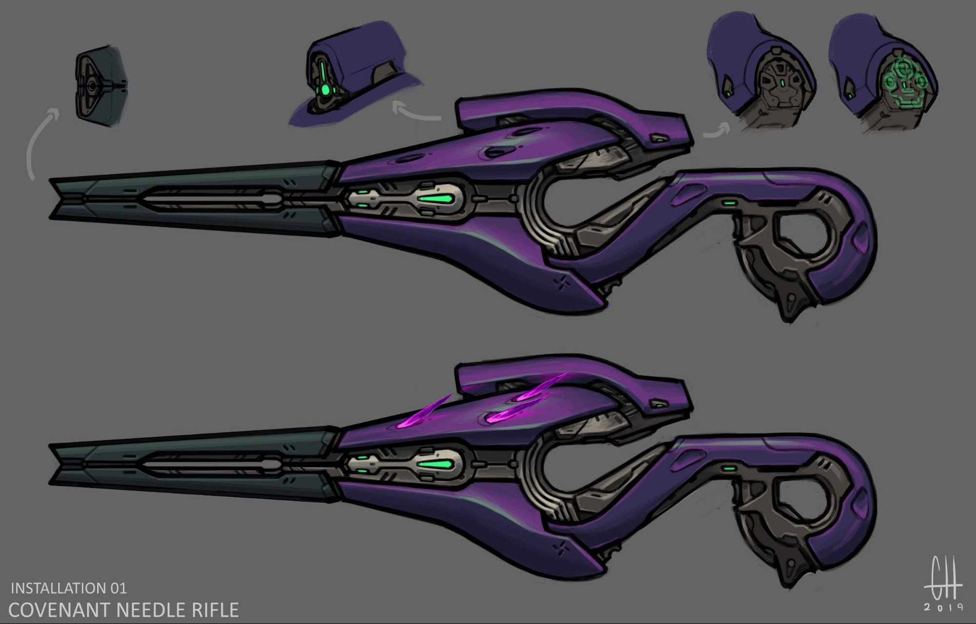
Installation 01’s take on Covenant design revolves around circles. Every weapon, vehicle, and piece of architecture will focus on this motif. This means that the major features of every covenant asset will conform to the curve or a circle, with little to no compound curves. This means the wavey stuff of yore has gotta go.
The covenant chitin/ shell is an iridescent material. The albedo is a (variable) shade of light blue with an (again, variable) dark red edge highlighted that’s been murdered with blur. The goal here is to achieve a pinkish purple that has a wash of red in the convex areas. The microdetails are full of subtle marbling while the surface is covered in a fine porcelain cracked pattern. The goal is to make something that looks elegant, ancient, and something that looks like it should be a lot more fragile than it is. Think about polished geodes, except at a much lower contrast.
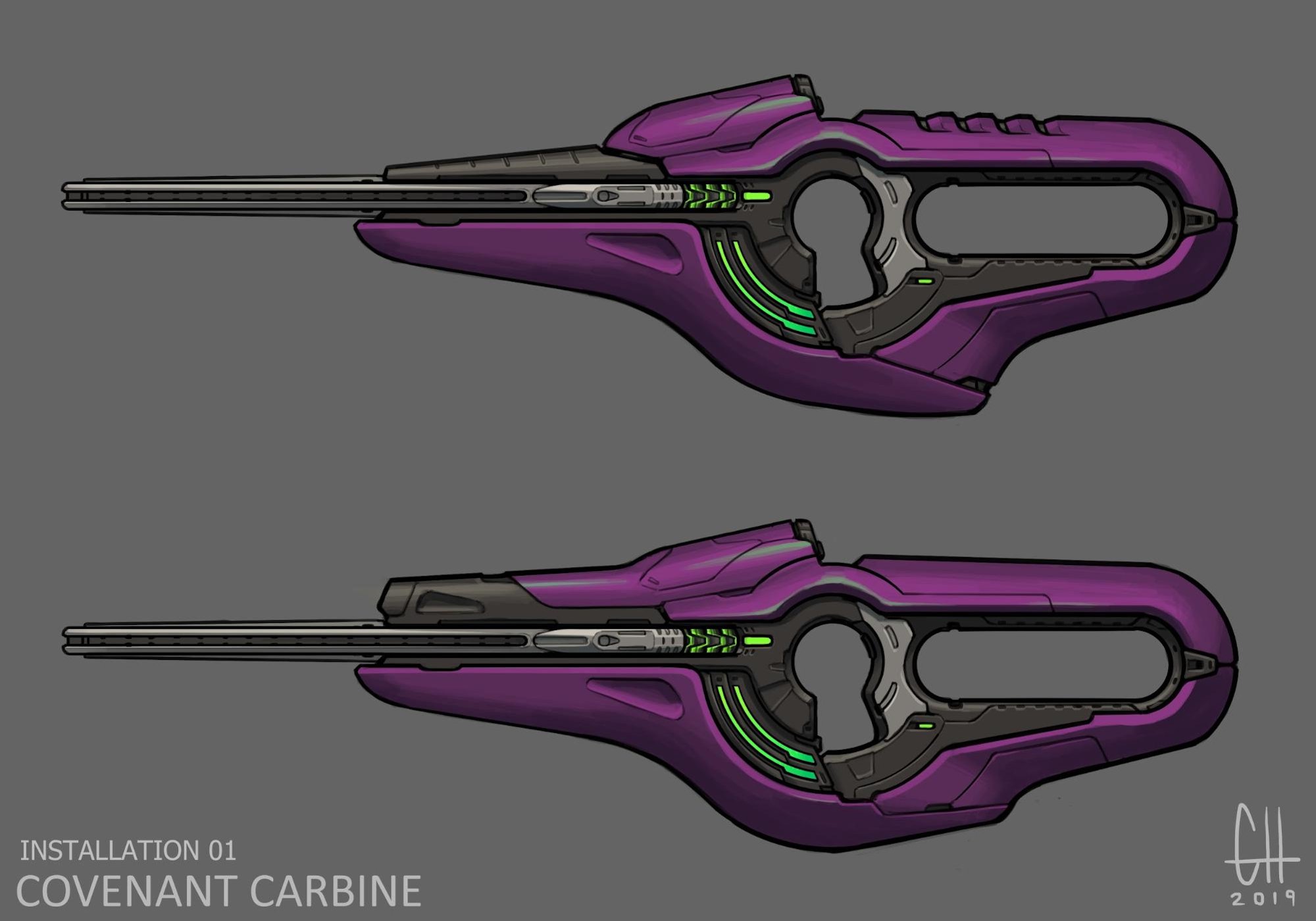
All of this should ultimately lead up the main style you see and will see on many of our Covenant style models in the future.
Forerunner Style
Next up we have our patent pending (not really, please don’t sue us 343) Forerunner style. This style is somewhat trickier as the Forerunner haven’t been as well established over the series like the Covenant or UNSC have. We also as of right now haven’t had as much work with Forerunner models as we have any of the other styles so it’s not fully set in stone. Nonetheless, we do have our own idea of the style.
The Forerunner is a culture absolutely obsessed with death. They’ve dedicated their technology to preserving the dead, living after their own death, and to an extent, literally collecting souls. What this means is that Forerunner technology should be beautiful from a distance, but rather unsettling up close. The motif of the fetishization of death should be apparent in the structures and models.
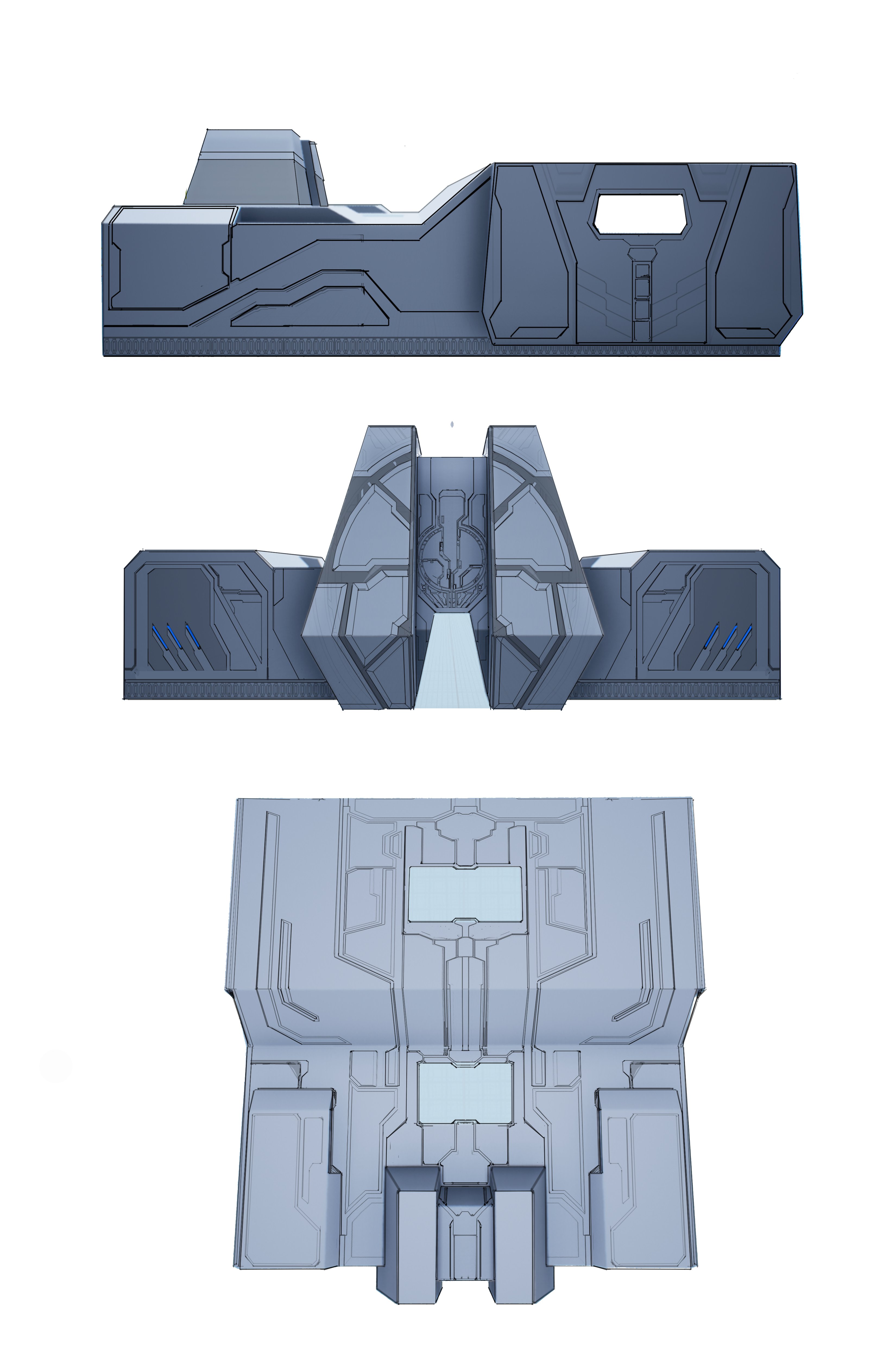
If the Covenant's main focus was on circular shapes and patterns, then the Forerunners main structure would be the triangle. On a macro level, all forerunner architecture and weaponry conforms to triangles and triangular shapes. Forerunner features and forms should be able to be constructed using mainly if not almost only all triangles.
Many of the previous Forerunner models and structures that we’ve seen have lights going throughout the model, this is a staple for the designs. Installation 01’s take on these lights would see that line instead filled in with an almost organic, grungy, sort of greeble with a faint blue/green glow coming from within. The style of this greeble would resemble something similar to the works of Zdzisław Beksiński.
Something important to this style that we’re looking to maintain is the idea that if any body parts are being represented in the structure, that we avoid implementing a full face at all costs. No grinning guardians.
UNSC Style
Last but certainly not least is arguably the most important style of the three, our UNSC style. This style has been very well showcased throughout the series and has remained fairly consistent regardless of the game. It only made sense that we also had a relatively straightforward approach to this style to do it justice, if not just to remain faithful to the design.
If the main selling point of the Covenant was the circle design, and similarly for the Forerunner the main idea being the triangles, then the UNSC would follow suit with the design more focused on boxes.
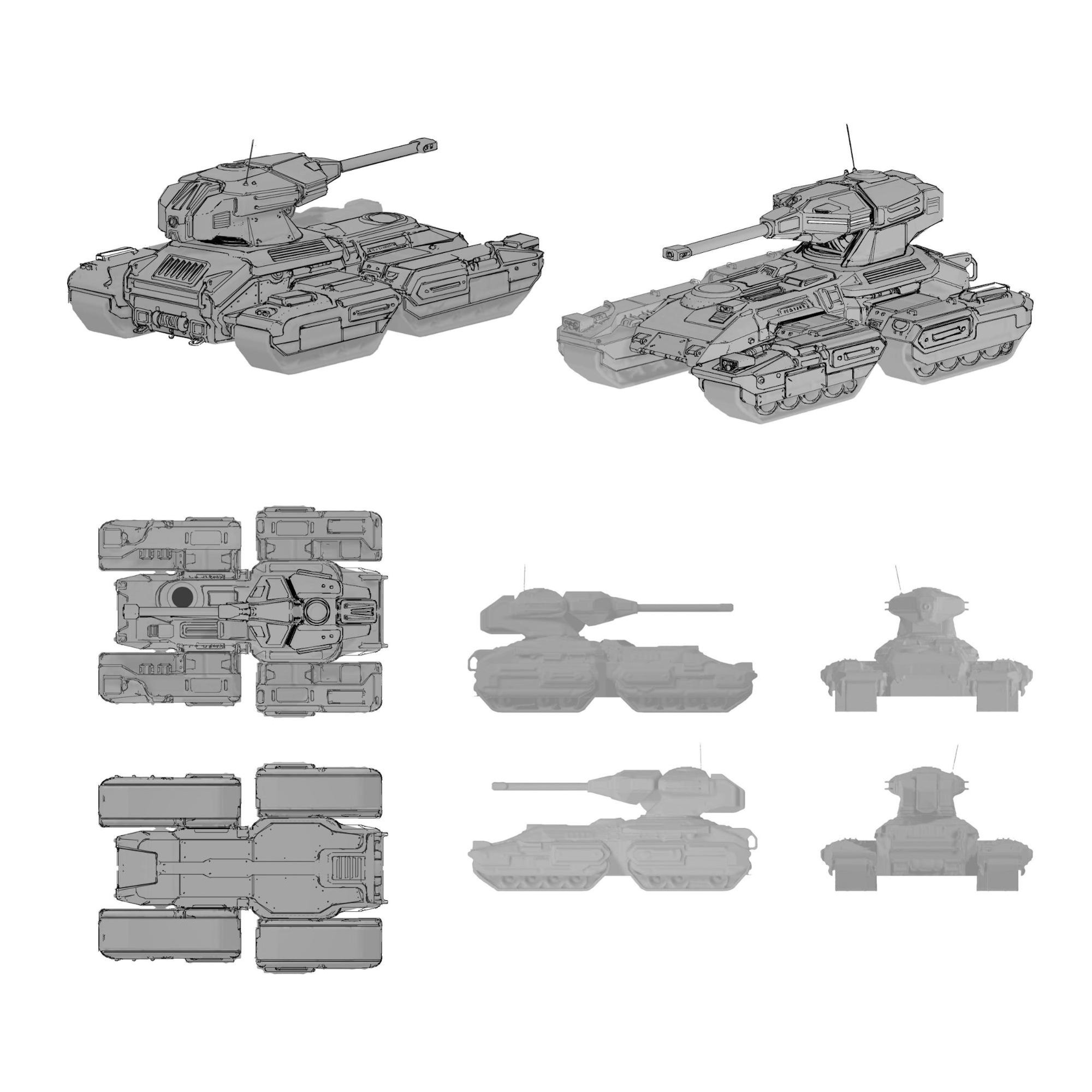
These are people years into the future, and far more technologically advanced. Yet, that's just the thing, they are still just regular people (for the most part). We didn't want to lose sight of that and have this over the top, impossible to ever achieve look. The idea was to create something that still looks human made and probable, but also still shows they are more advanced than the modern era.
The overarching theme is to design something with a simple yet sturdy base, that's heightened to the next level comparatively to what we might have seen before. It's a lot of olive/dark greens, with black and silver, over simple shapes that look reliable. It's the sort of classic UNSC style you have seen in any one of the games, just baked with a little bit of i01 magic and love in it, in order to give it an updated look.
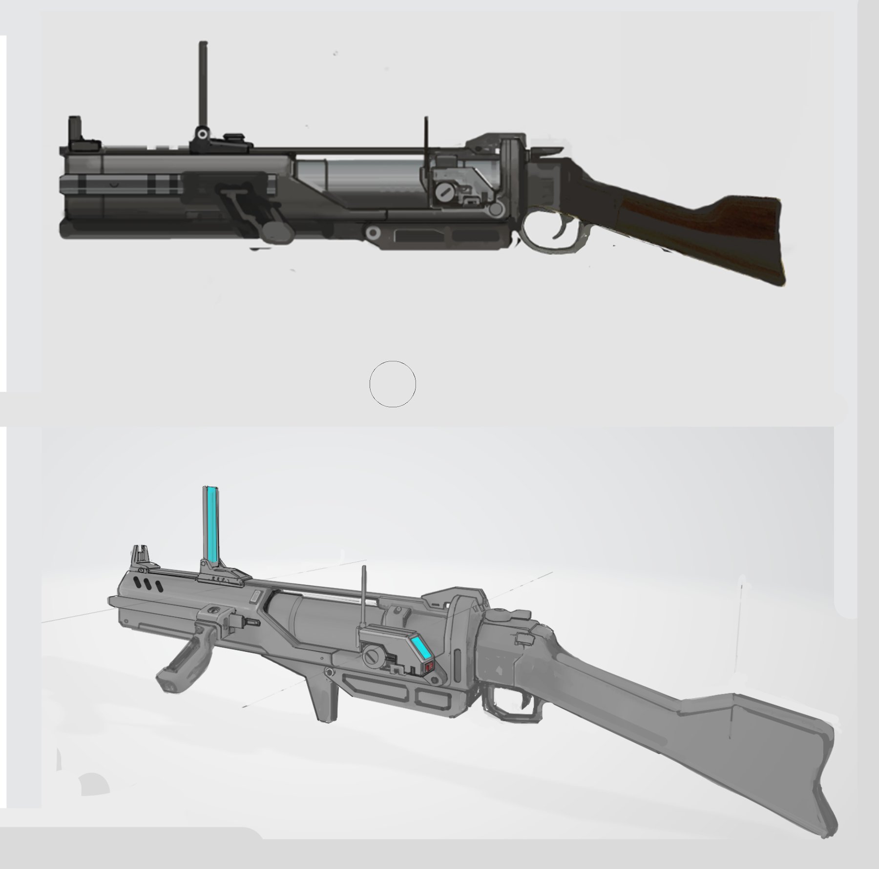
Timeless
It's that time of the update again, the time when we ask you to join. It's here every update, and will likely continue to be in every update going forward. So, why don't you just hit that lovely little button down there and apply for the team. You'll never have to worry about this again, just a quick one and done. Think about it… it'll be here when you make a decision.
Blame Bean
Bean is here once again to deliver to you an important message. "What's the message?" you ask. Well, thanks for asking, but I think it's rather straightforward. It's a reminder to always wear protection. I'm not just talking about the mask either. So, follow Bean here, and stay safe out there. We don't need anything catching us by surprise.
The end is nigh now, and as such we must part ways once again. The good news is we'll be back again in another 2 weeks so long as America is able to hold out that much longer. Once again I must remind you to properly wash your hands. A good tip is to wash them for as long as it takes to sing Installation 01 Original Soundtrack - Seeds of Time (1 hour) at least twice, in order to receive the utmost cleanliness.
Sev
Reddit Comments
View all comments